From May to August of 2026, I had the opportunity to intern with the Creative Services Team at The Penn Mutual Life Insurance Company. Throughout my time on the team, I collaborated with a team of creatives to streamline communication for both clients and financial professionals through easy-to-understand graphics. This included, but was not limited to, product pieces, social media graphics, and designs for internal communications. Below is a few samples of work I created and my process behind it.
Holiday Graphics
One of my roles at Penn Mutual was creating social media graphics and email banners for the company to post on LinkedIn and share with financial professionals. The primary purpose of these graphics was to inform Penn Mutual's general audience that financial offices would be closed specifically on Juneteenth and the Fourth of July. My goal was to incorporate the Penn Mutual type face while expanding slightly outside the brand's color palette to include elements typically associated with these holidays.
Juneteenth
For my Juneteenth social graphics design, I began the process by researching colors and elements that were most commonly associated with the Juneteenth holiday. My research allowed me to learn that the color is red, green, and yellow are commonly associated due to them being the colors of the Pan-African flag. The pan African flag represents unity and strength which within black culture, which I wanted to highlight within my design. While symbols, such as the raised fist, are also commonly associated with Juneteenth, I wanted to take a more abstract approach and allow the colors to be the element that is associated with the holiday. Once I had completed my research, I then began designing multiple concepts.
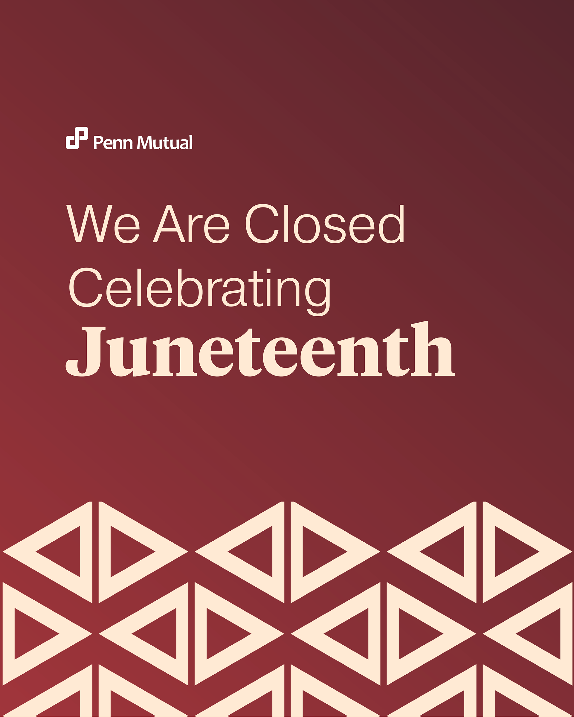
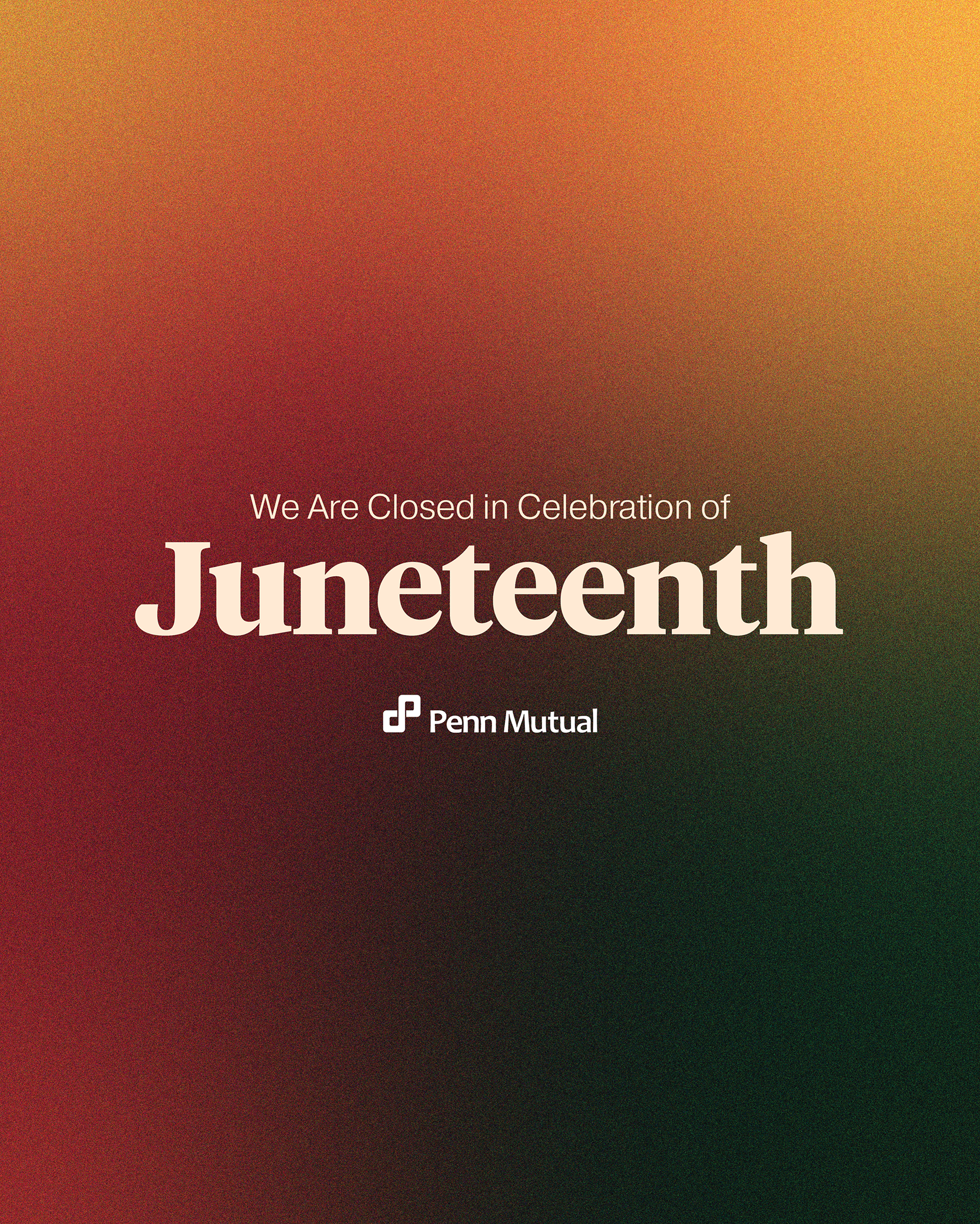
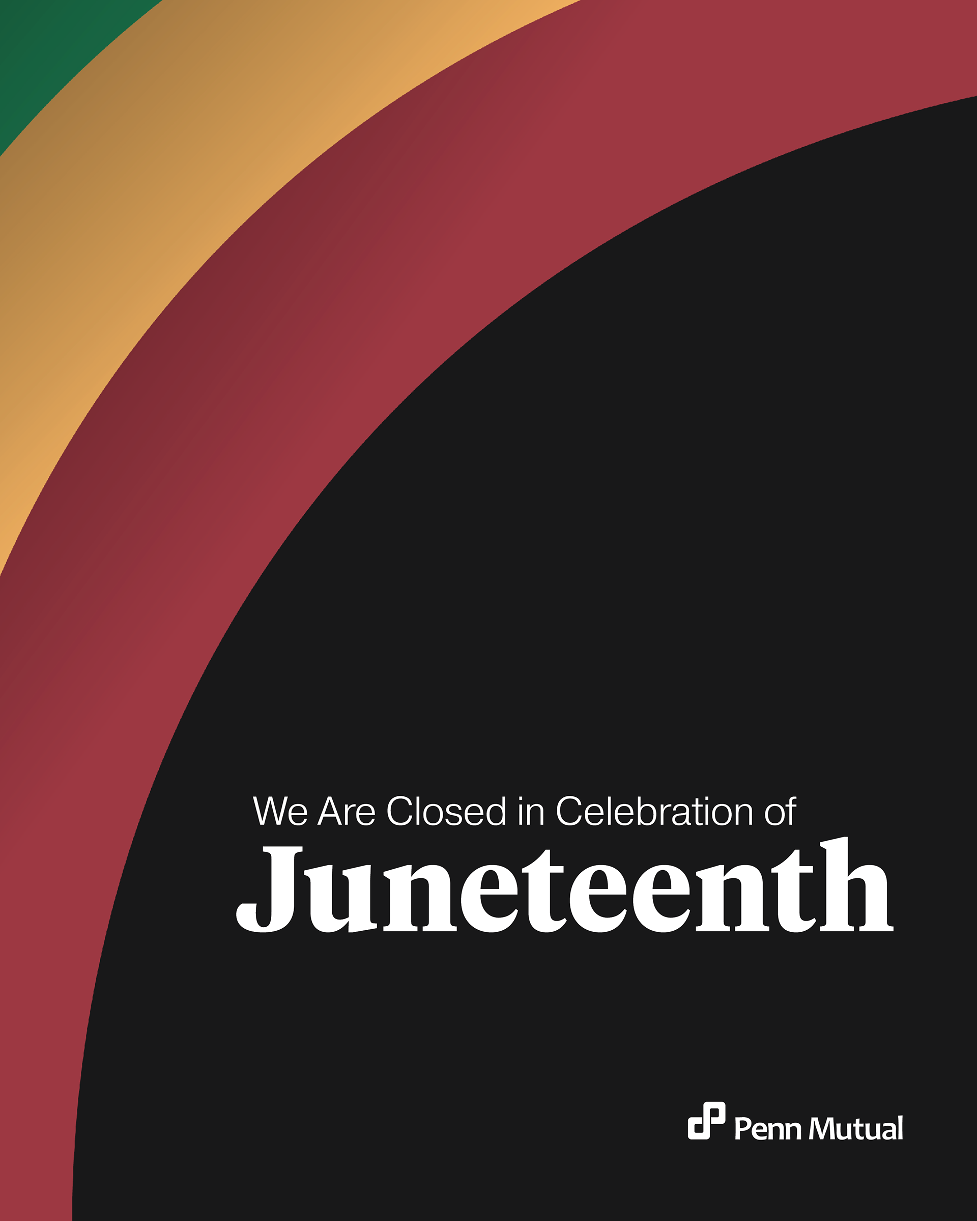
As you can see from the concepts and the finalized LinkedIn post, I leaned heavily into the color palette and experimented with different shapes, layouts, and typography that still utilize the Penn Mutual branding while also experimenting and allowing these common elements to shine. Once I completed my four design concepts, I collaborated with the creative team to further refine these designs, ensuring that the typography was up to Penn Mutual standards and that the appropriate logos were legible and had the necessary spacing. The final design was picked by Penn Mutual's marketing team, and I feel it accurately represents the Juneteenth holiday. The colors the day is known for also stuck true to the typography rules set for the company branding.
Fourth of July
For my July 4 designs, I experimented with utilizing red, white, and blue to represent the American flag, as well as symbolism traditionally recognized for Independence Day, such as fireworks and the American flag itself. Like the Juneteenth designs, I also had to keep in mind the typography rules and logo usage to ensure that it was recognizable and fit within brand guidelines. Once I understood what elements and rules were in place for this design project, I began developing concepts in multiple versions that emphasize these commonly known symbols.
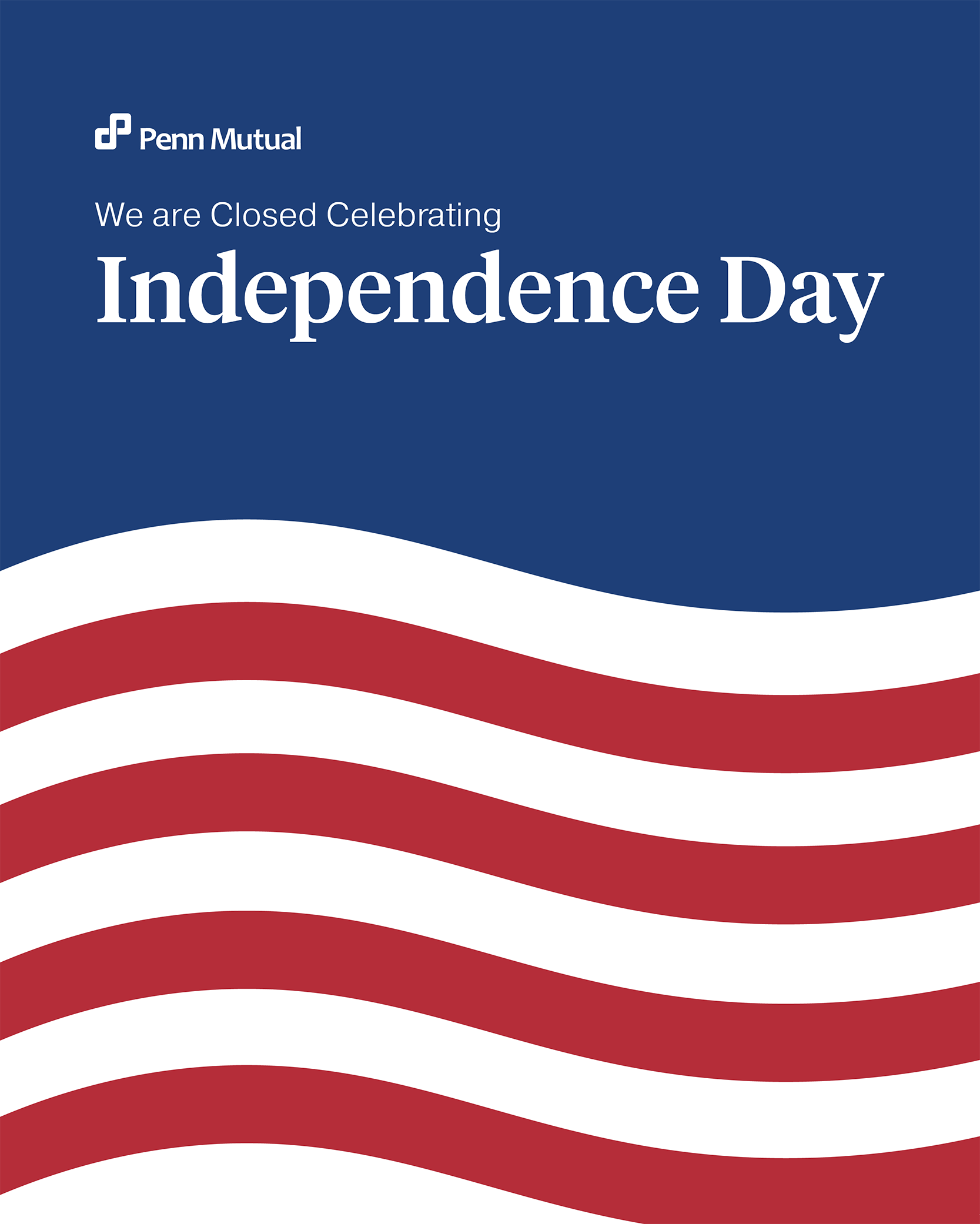
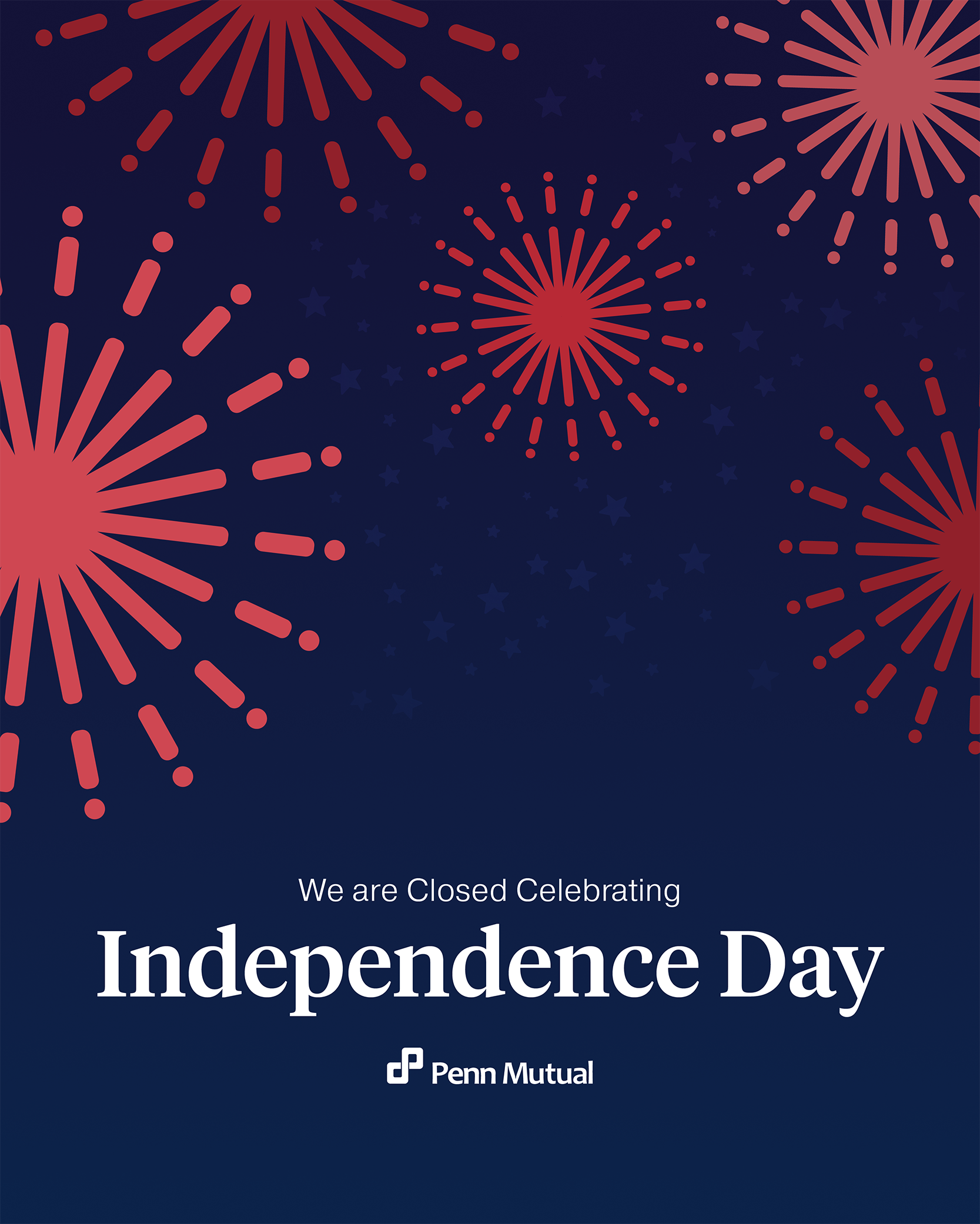
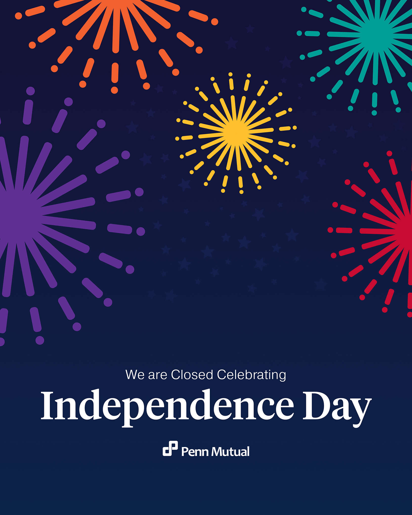
The first design I came up with was fairly simple, as it focused on the red and white stripes of the American flag; however, I added a wave element to create more of a dynamic layout. On the other hand, I also wanted to experiment with fireworks, as they are typically associated with the celebration of Independence Day. In my first round of design concepting, I created fireworks in different values of red to bring in the red known in the American flag and in the holiday itself; however, after collaborating with the creative services team, we also decided to try a version utilizing brand colors within Penn Mutual's color palette to help bring in more brand awareness and make the fireworks have more variation. Ultimately, after giving these three versions to Penn Mutual's marketing team, the version with the red fireworks was selected.
IFN IN ACTIOn
IFN In Action is a LinkedIn newsletter for the company's Independence Financial Network. The goal of this publication is to inform financial professionals about news and information pertaining to their fields. When tasked with creating the branding for this newsletter was to stay consistent with the Penn Mutual branding to ensure brand recognition. When concepting, I ensured that I included multiple elements that Penn Mutual is known for, including:
• Penn Mutual Greens & Blues
• Typefaces commonly used in branding
• The continuum symbol
But I also wanted to add elements of movement to emphasize the "In Action" namesake of the publication. Before concepting, I experimented with ways that I could incorporate motion into the static imagery, including experimenting with size variation & opacity to create depth, using perspective to show movement, and utilizing imagery to show financial professionals working and in action.
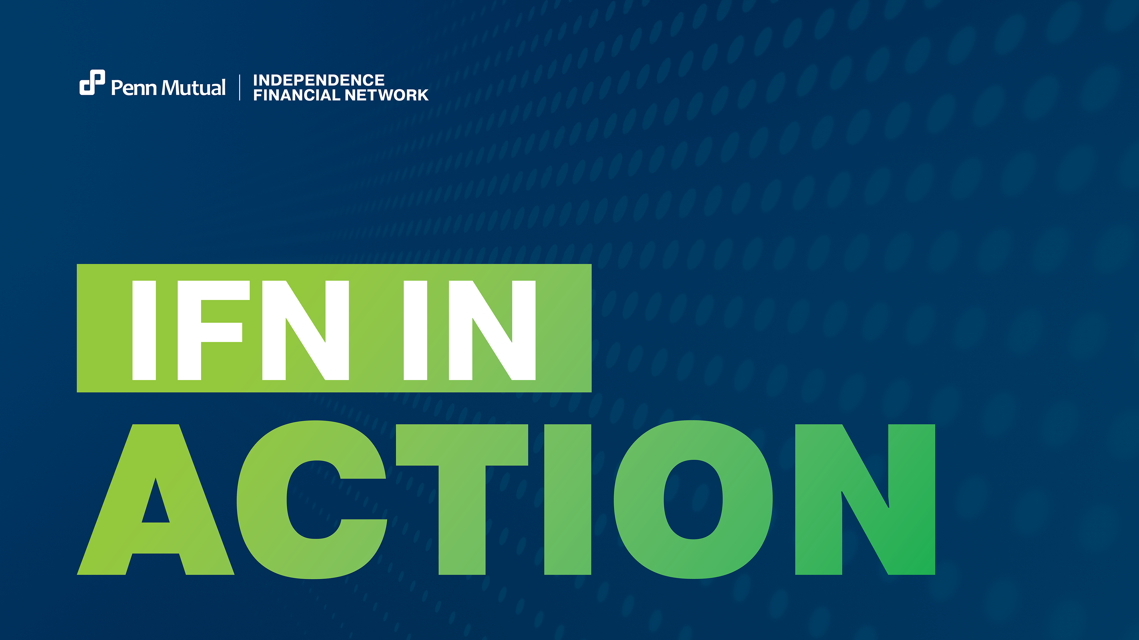

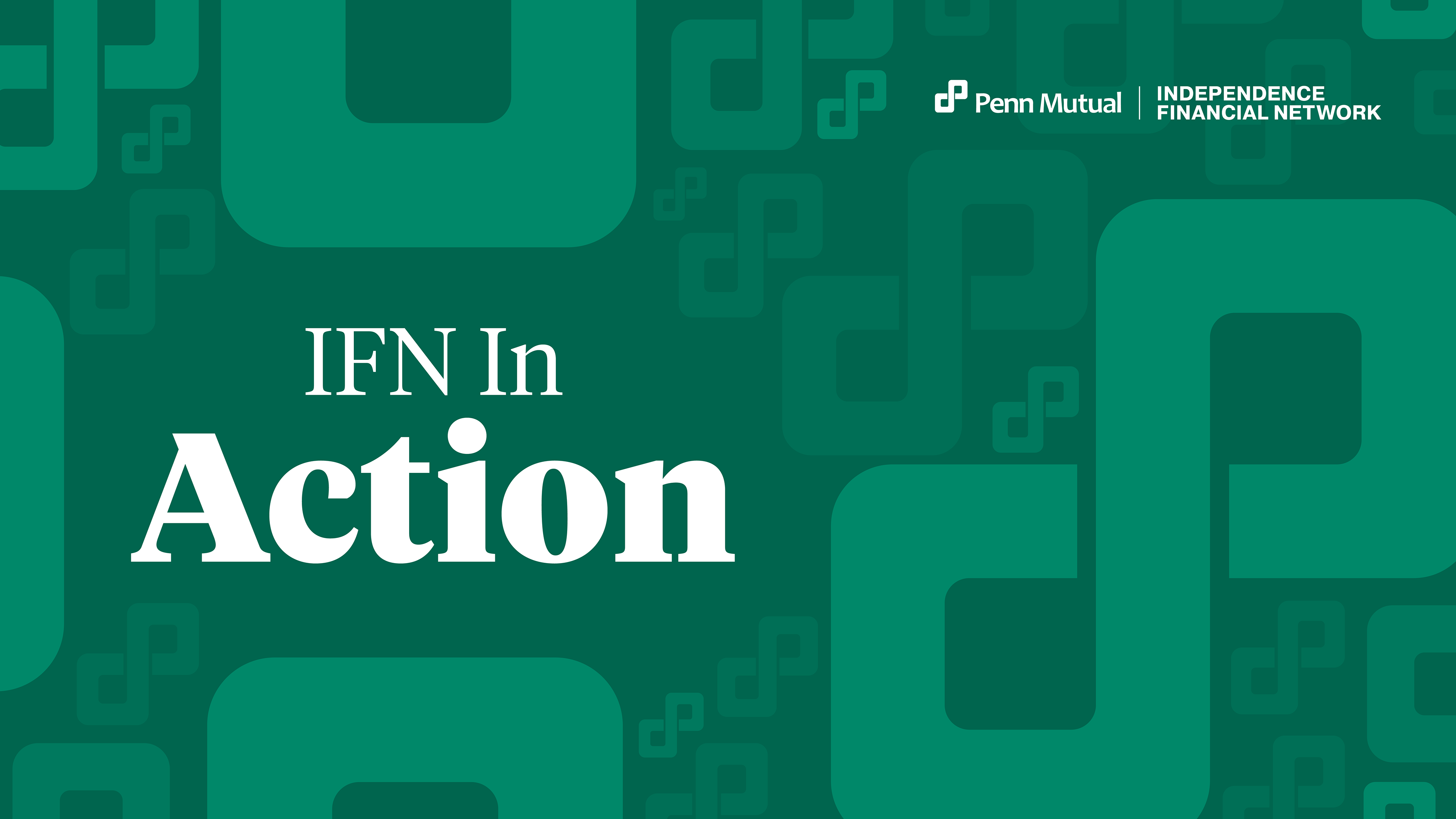
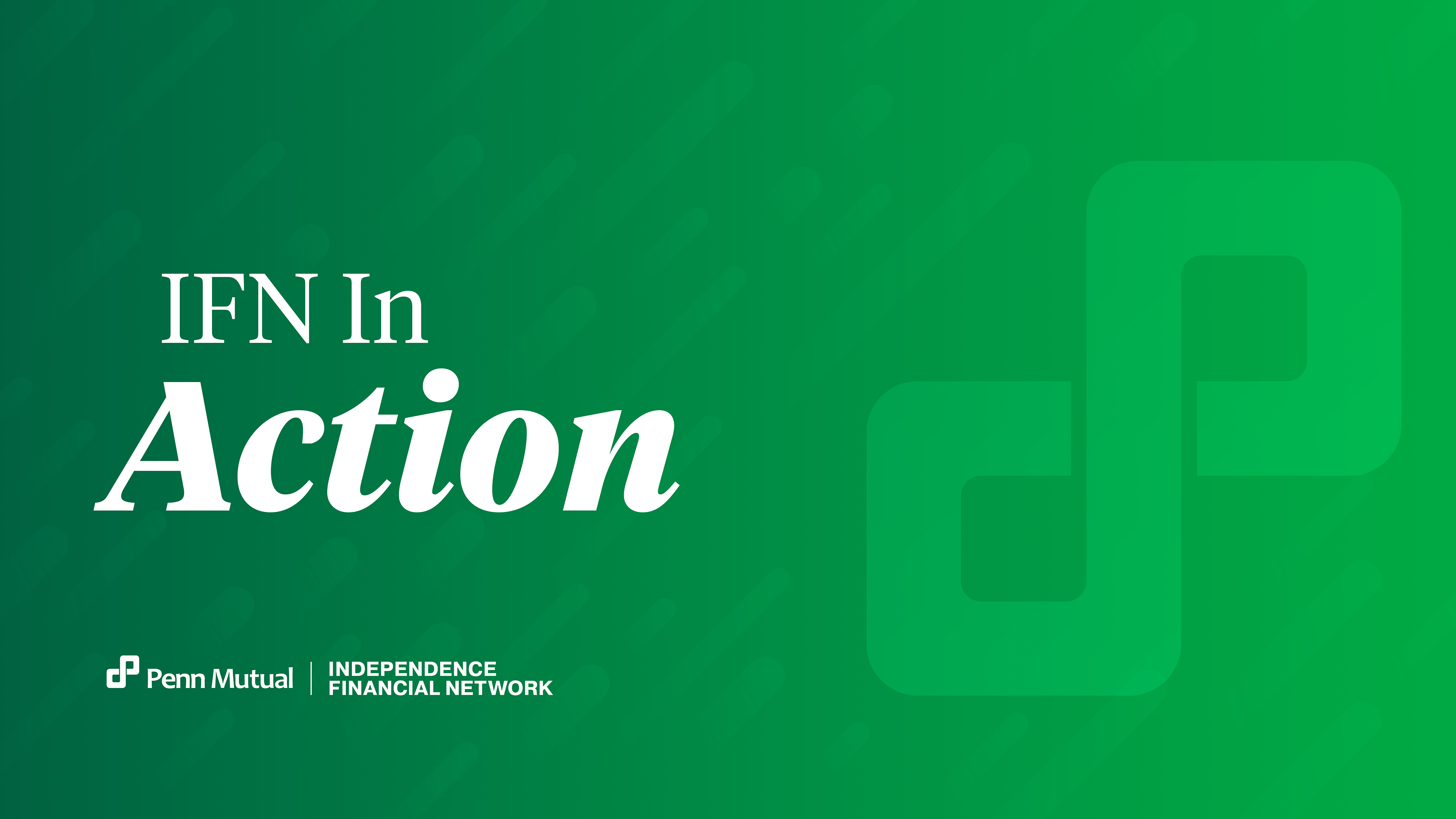
It is evident from the different directions I explored for this assignment that one aspect was clear: action. After collaborating with the rest of the Creative Services team and consulting the marketing team, we decided to combine elements from the bottom two versions, as the pattern of the continuum was favored in the left version, but the typography of the right. In the end, the final version encapsulates the desired motion, professionalism, and consistency with the branding that was desired.